- under moonlight as ever
- need to fit both Legion and Sentinels of Mars detachments visually
- need to paint at least 20 of them
- back to impact, strong shadow and light - where the Knight as such a big object was a challenge
Test trooper done.
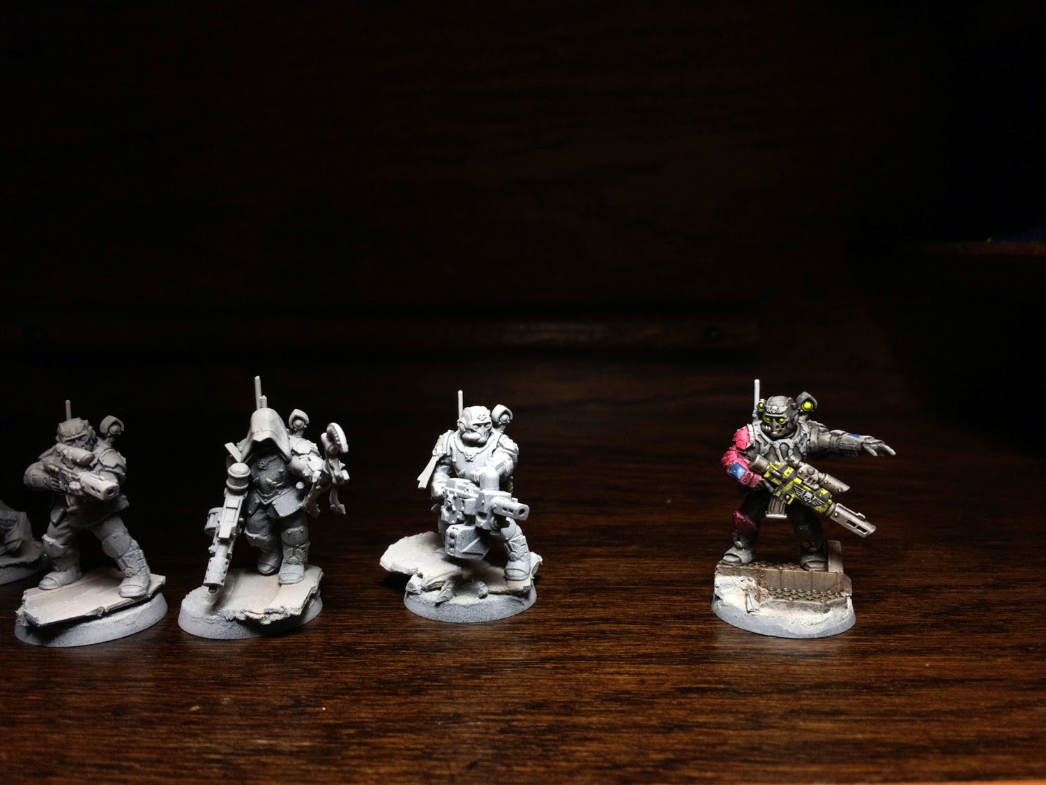

reminder, that they ares up posed to fit this lot nicely:
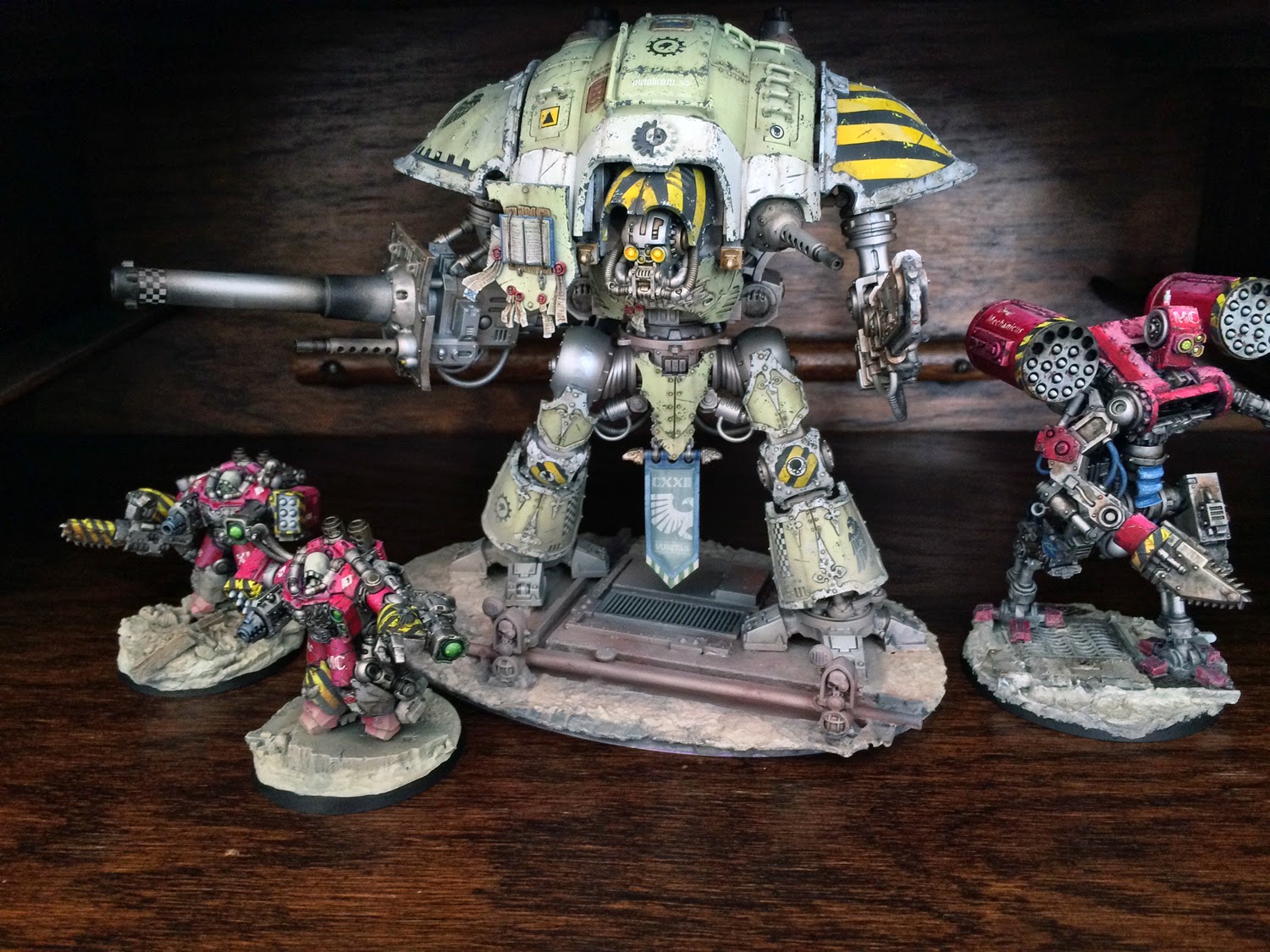
They look great and tie in very well with the rest of the force. I'm torn on whether or not it would be a good idea to have some red on the left shoulder aswell. On the models firing that is the "forward" shoulder and it might benefit from some colour. Maybe some strong unit marking on that shoulder might do the trick instead if one want to keep the "split" colour scheme (that certainly has a strong appeal).
ReplyDeleteLook forward to see more!
Thanks. I originally planned both arms to go red - I see your point. I should also maybe add more purity seals on the rest of them to get little spots of variety and color.
ReplyDeletei don't like the full red arm, i believe having both shoulder pads should be red, the full arm contrasts too much from the rest of the model. The grey colour is amazing though and the yellow is a good contrast
ReplyDeleteVery inspirational stuff as always. I have really enjoyed lurking you page for quite awhile now and I must say I am always excited to see an update.
ReplyDeleteCurrently I am tossing around some ideas of my own for a 40k mechanicus army, but have been struggling with representing the skitarii. What made you choose to go with non robed skitarii? (Obvious the scion models are amazing!)
Do you mind sharing your list? Having looked over the new IG book and really wanting to use them to represent the bulk of my ad mech army, it would seem the marine book just works better, you're using them as scouts after all. What are your thoughts on this approach?
Either way I'm excited to see what comes next, keep up the good work!
Thanks Matthew.
DeleteOriginally I only intended to build a Battle Automaton to rep a rifleman dreadnought for the Legion, but then the Centurions were released and I liked some of the model but not the overall look, so turned them to a Mechanicus unit, and now new storm troopers that screamed to me Skitarii elite... Very dynamic.
Plan is to build three detachments that eventually are full armies themselves. Legion/inquisition using GK codex, Imperial Guard using IG and Mechanicus using SM Sentinels of Terra supplement.
I think I agree with Alan on the red arm - the armour and yellow spots are brilliant - the yellow complements that muted armour perfectly.
ReplyDeleteThe red is too much I think - there is too much of it and from my screen it is overbearing and throws the dynamic of the model. I think the problem I'm having is that the red carries on down that arm and then jumps to the knee pad - so based on the posing of that model in that photo in isolation - it looks like you have done a half and half painting approach.
Personally, I would pull back the red, definitely off the knee, and probably up the arm leaving it only on the pad. I cant tell from this photo, but I would almost swap the red to the left shoulder pad only - that way you have the yellow gun casing coming off the right arm which generally is visually front centred on most models, and put the red on the left which again generally, has more of a rear bias - so from different angles you would present contrasting views.
Only my two cents mate - otherwsie, lovely work and I look forward to seeing the first 5, let alone all 20 in a unit shot.
Very nice and very effective!
ReplyDeleteI have to agree with the previous speakers though - the completely red arm is a bit much. I´d go with red right shoulderpad and left kneepad to create a interesting diagonal.
Thanks for the feedback guys. Much appreciated!
ReplyDelete"Bit much" is the second name of the project. :) Red arm stays, because I like it, but I get the balance comment and have been pondering it myself and decided to paint the left shoulder with yellow chevrons to tie in with the weapon and because you cannot have enough yellow hazard stripes! Left knee may get a white marking like the back of the torso armor which you haven't yet seen.
I would put the left hand gauntlet in the same red as the arm, both for color balance, and to suggest that the red indicates that anything that touches or supports the weapon is imbued with a certain violence. The red knee pad I would then do in the hazard chevrons to fit with the Knight and the foremost model on the bottom picture.
ReplyDeleteGreat looking test model! Really interesting color scheme all around. I really like how you paint your reds. My favorite part is his chevroned bolter. I like the idea of giving his other shoulderpad chevrons. I look forward to seeing some more angles of the model. That will help me get a better sense of the color scheme overall.
ReplyDeleteLove the red arm, just need some balance (as has been said) - instead of adding red or chevrons to the other arm, what if you did the opposite (left) half of the chest plate red - you already have a red right arm and right knee pad!
ReplyDeleteAnyway, as you said up there - "The red arm stays because I like it!" and that's the philosophy we should aspire too, both with our own models and others - we all like different things, which is what makes following other's art so interesting!